Learners, In this article we are going to design a very interactive and impressive CSS property which is a Presse Button Click Effect.
Learners let me tell you we often get interact with 3d items in our day to day daily life there is a craze for watching 3d movies and also nowadays as programmers to bring ourselves stressfree we used to solve rubric that is in 3d shape so, you can’t say we didn’t interact with three item. Actually, it is that design that exceptionally makes a beautiful production appearance.
Presse Button Click Effect Using Html Css Code
This is a real-life 3d effect but we can also make a 3d elements in our webpages as well like by today’s blog we will look 3d buttons but there is almost every component of the website we can design to 3d shape. we are going to design it by yourself, so just join me on this blog and make sure your finger is free for scrolling down .
Hey learners!
Welcome to our today’s blog with code with random. In this blog, we gonna learn how we can design a Presse Button Click Effect Using Html And Css.
I hope you must have got an idea about the project.
Let’s have a look at our project.
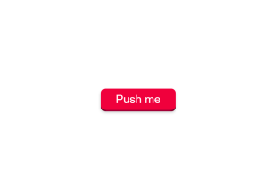
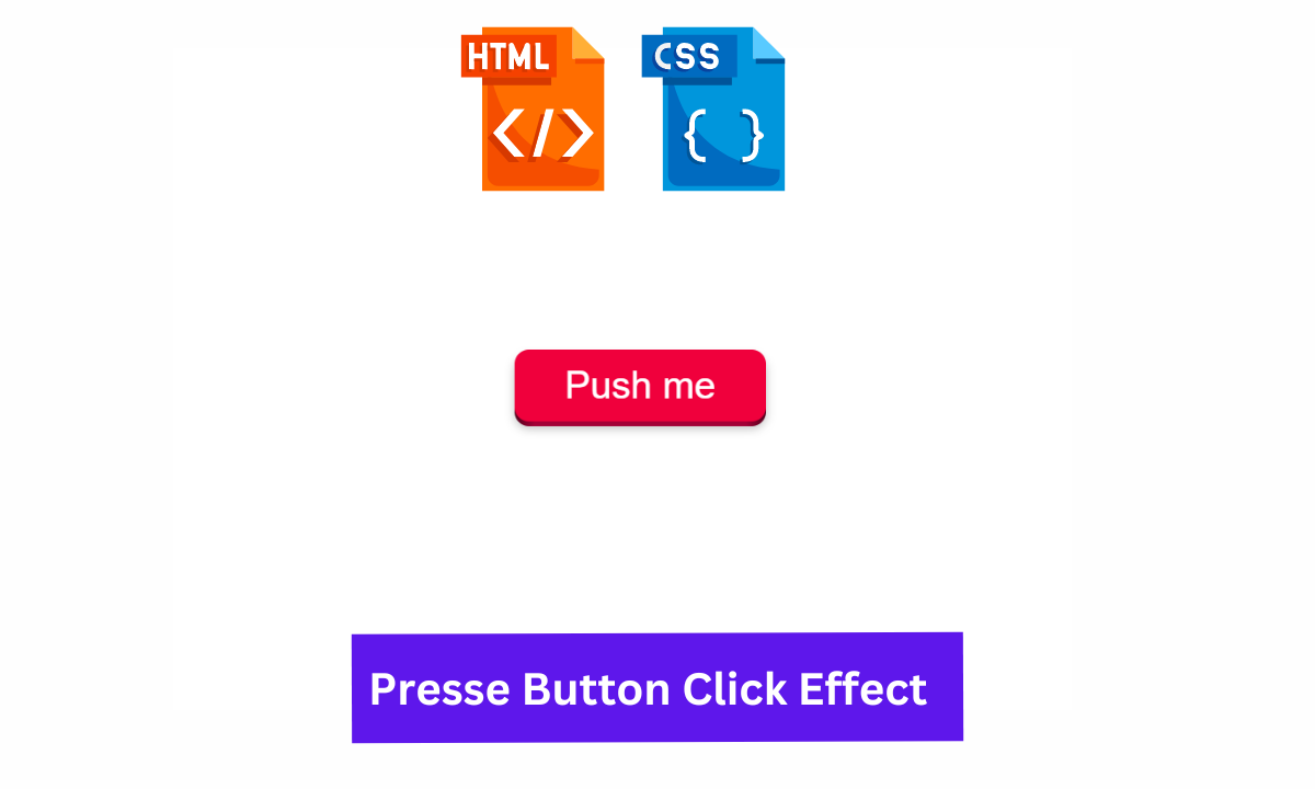
If you are able to observe this attached image then you can easily see that button is in 3d shape means it is uplifted from the surface and we can observe all three aspects of a button as x, y, and z axis.
HTML SECTION For Presse Button Click Effect
Here I’m not going to add a structure of the HTML file from scratch, I will just paste the body part, it is so because the body is the main part of our designing a browser.
So, let’s have count what is in the HTML part:-
We have a button with a class pushable div.
Then we have a span with class shadow and a span with a class edge.
In the end, we have spam with class front containing a text as Push me.
100+ Front-end Projects for Web developers (Source Code)
Go through the below code and run it in your IDE or where you used to design just HTML without CSS styling.
<button class="pushable">
  <span class="shadow"></span>
  <span class="edge"></span>
  <span class="front">
    Push me
  </span>
</button>
CSS SECTION For Presse Button Click Effect
By CSS we will design all the div and bring them to the center with the help of grid property and will also focus on all the three-span to design in the 3d view.
The Below code will analyze you more. So just add in your HTML half complete file and wait to watch some magic.
body {
  display: grid;
  place-items: center;
  height: 100vh;
}

.pushable {
  position: relative;
  border: none;
  background: transparent;
  padding: 0;
  cursor: pointer;
  outline-offset: 4px;
  transition: filter 250ms;
}

.shadow {
  position: absolute;
  top: 0;
  left: 0;
  width: 100%;
  height: 100%;
  border-radius: 12px;
  background: hsl(0deg 0% 0% / 0.25);
  will-change: transform;
  transform: translateY(2px);
  transition: transform 600ms cubic-bezier(0.3, 0.7, 0.4, 1);
  filter: blur(4px);
}

.edge {

  position: absolute;
  top: 0;
  left: 0;
  width: 100%;
  height: 100%;
  border-radius: 12px;
  background: linear-gradient(
    to left,
    hsl(340deg 100% 16%) 0%,
    hsl(340deg 100% 32%) 8%,
    hsl(340deg 100% 32%) 92%,
    hsl(340deg 100% 16%) 100%
  );
}

.front {
  /*
  this uses relative positioning, since we need 1 in-flow child to give the <button> its width and height.
  */
  display: block;
  position: relative;
  padding: 12px 42px;
  border-radius: 12px;
  font-size: 2rem;

  color: white;
  background: hsl(345deg 100% 47%);
  will-change: transform;
  transform: translateY(-4px);
  transition: transform 600ms cubic-bezier(0.3, 0.7, 0.4, 1);
}

.pushable:hover {
  filter: brightness(110%);
}

.pushable:hover .front {
  transform: translateY(-6px);
  transition: transform 250ms cubic-bezier(0.3, 0.7, 0.4, 1.5);
}

.pushable:active .front {
  transform: translateY(-2px);
  transition: transform 34ms;
}

.pushable:hover .shadow {
  transform: translateY(4px);
  transition: transform 250ms cubic-bezier(0.3, 0.7, 0.4, 1.5);
}

.pushable:active .shadow {
  transform: translateY(1px);
  transition: transform 34ms;
}

.pushable:focus:not(:focus-visible) {
  outline: none;
}

/* --- */

.pushable:focus:not(:focus-visible) {
  outline: none;
}

.pushable {
  -webkit-tap-highlight-color: transparent;
  user-select: none;
}
For a live preview, you can follow the below codepen.
Final Output Of Presse Button Click Effect Using Html Css
By this blog… We have learned how we can design aPresse Button Click Effect Button…
Now I’m looking for your reviews.
So, How was the blog , Learners!
If you want a more crisp blog like this then please check our Blogs sites CodewithRandom. keep tuned with us because every day you will learn something new here.
Age Calculator Using Javascript
I hope that I’m able to make you understand this topic and you have learned something new from this blog. If you faced any difficulty feel free to drop a comment down your problems and if you liked it, please show your love in the comment section. This fills blogger’s hearts with enthusiasm for writing more and new blogs.
You can follow me on Instagram
Written by @Ankit kumar
ADVERTISEMENT
Code by @Lichfolky
ADVERTISEMENT
