Create Congratulations Animation Using HTML, CSS, and JavaScript
Hey Guys, Welcome To Our Blog, In Today’s Blog We Are Going To See How To Create a congratulations Animation Using HTML, CSS, and JavaScript. This tutorial is going to be completely beginner-friendly. This is purely based on animation in which we enter the congratulations text and make it animate superbly by using CSS and HTML.
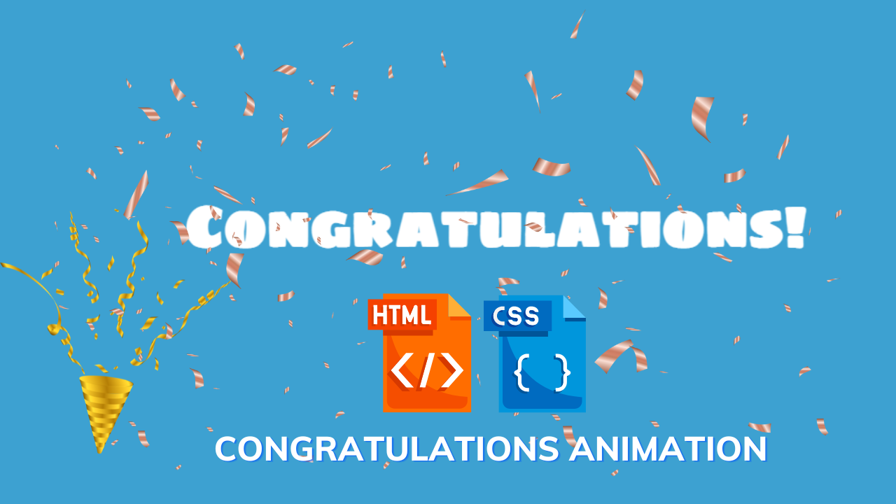
Preview of Animated Congratulations

This is purely based on animation in which we enter the congratulations text and make it animate superbly by using CSS and JavaScript.
| Code by | Joe Hastings |
| Project Download | Link Available Below |
| Language used | HTML ,CSS and JavaScript |
| External link / Dependencies | YES |
| Responsive | YES |
So, Let’s Begin Our Congrats Animation Journey By Adding The Source Codes. For That, First, We Are Using The Html Code.
50+ HTML, CSS & JavaScript Projects With Source Code
HTML CODE For Congratulations Animation
<div class="congrats">
    <h1>Congratulations!</h1>
</div>
Here We are simply adding the “CONGRATULATIONS” Text in the header h1 tag inside a div tag with a separate class name. Further, We start making animations on it using the CSS and JavaScript properties.
Output:

Portfolio Website using HTML and CSS (Source Code)
CSS CODE For Congratulations Animation
Below is the code for the congratulations animation CSS. Create a file name as index.css and paste the following code.
@import url(https://fonts.googleapis.com/css?family=Sigmar+One);

body {
    background: #3da1d1;
    color: #fff;
    overflow: hidden;
}

.congrats {
    position: absolute;
    top: 140px;
    width: 550px;
    height: 100px;
    padding: 20px 10px;
    text-align: center;
    margin: 0 auto;
    left: 0;
    right: 0;
}

h1 {
    transform-origin: 50% 50%;
    font-size: 50px;
    font-family: 'Sigmar One', cursive;
    cursor: pointer;
    z-index: 2;
    position: absolute;
    top: 0;
    text-align: center;
    width: 100%;
}

.blob {
    height: 50px;
    width: 50px;
    color: #ffcc00;
    position: absolute;
    top: 45%;
    left: 45%;
    z-index: 1;
    font-size: 30px;
    display: none;
}
In the First Step, We are just importing the font family using the import property and then we are fixing the background color, font color, and overflow to hide the content that overflows among others.
In the Second Step, We now start styling the div class property by fixing margin and padding values, then alignment values and the position of the content to relative for avoiding changes.
Restaurant Website Using HTML and CSS
Those explanations have been given as code below.
@import url(https://fonts.googleapis.com/css?family=Sigmar+One);

body {
    background: #3da1d1;
    color: #fff;
    overflow: hidden;
}

.congrats {
    position: absolute;
    top: 140px;
    width: 550px;
    height: 100px;
    padding: 20px 10px;
    text-align: center;
    margin: 0 auto;
    left: 0;
    right: 0;
}
In the Third Step, Now we call out the h1 tag and perform some animate properties, and style the content to make it attractive. For animate, we have used the transform property in which the text may perform some changes and give out the width height, and font along with z-index properties to make text bigger, properly aligned, and better.
Create Background Slider Image Using Html And Css Code
Then Finally, We are adding a BLOB section which you may find in javascript code to insert the stars and make the stars perform an animation. and for styling the star we have given properties in the blob section, some properties like width, height were used for star sizes and position and alignments for adjusting it and fixing the stars with other content without making changes. and some colors and fonts were used which is common.
The above explanation is given in the code below.
h1 {
    transform-origin: 50% 50%;
    font-size: 50px;
    font-family: 'Sigmar One', cursive;
    cursor: pointer;
    z-index: 2;
    position: absolute;
    top: 0;
    text-align: center;
    width: 100%;
}

.blob {
    height: 50px;
    width: 50px;
    color: #ffcc00;
    position: absolute;
    top: 45%;
    left: 45%;
    z-index: 1;
    font-size: 30px;
    display: none;
}
Now we have completed our CSS part, Then Its time to move on to JavaScript code for the performance of real-time animation. The Respective code is down below.
Output Of Congratulation Animation:
Below you’ll find the Image of Congratulations Animation which is our final output for the code we’ve described above.
ADVERTISEMENT

ADVERTISEMENT
ADVERTISEMENT
JAVASCRIPT CODE For Congratulations Animation
$(function() {
    var numberOfStars = 20;

    for (var i = 0; i < numberOfStars; i++) {
      $('.congrats').append('<div class="blob fa fa-star ' + i + '"></div>');
    }

    animateText();

    animateBlobs();
});

$('.congrats').click(function() {
    reset();

    animateText();

    animateBlobs();
});

function reset() {
    $.each($('.blob'), function(i) {
        TweenMax.set($(this), { x: 0, y: 0, opacity: 1 });
    });

    TweenMax.set($('h1'), { scale: 1, opacity: 1, rotation: 0 });
}

function animateText() {
        TweenMax.from($('h1'), 0.8, {
        scale: 0.4,
        opacity: 0,
        rotation: 15,
        ease: Back.easeOut.config(4),
    });
}

function animateBlobs() {

    var xSeed = _.random(350, 380);
    var ySeed = _.random(120, 170);

    $.each($('.blob'), function(i) {
        var $blob = $(this);
        var speed = _.random(1, 5);
        var rotation = _.random(5, 100);
        var scale = _.random(0.8, 1.5);
        var x = _.random(-xSeed, xSeed);
        var y = _.random(-ySeed, ySeed);

        TweenMax.to($blob, speed, {
            x: x,
            y: y,
            ease: Power1.easeOut,
            opacity: 0,
            rotation: rotation,
            scale: scale,
            onStartParams: [$blob],
            onStart: function($element) {
                $element.css('display', 'block');
            },
            onCompleteParams: [$blob],
            onComplete: function($element) {
                $element.css('display', 'none');
            }
        });
    });
}
Now the Java Script Code is successfully added. In this First part, We work with star animations for that we first create a function, and inside of the function we create a variable and we assign a value to it which the value is referred to as the star that we need during the animation for example here we have given 20 which means 20 stars will pop up that is done by JS.
ADVERTISEMENT
Then call the value and append the blob function of CSS to this JS Which is done inside of the for loop. and we have closed the function by calling value.
ADVERTISEMENT
Ecommerce Website Using HTML, CSS, & JavaScript (Source Code)
The code for the above explanation is down below.
$(function() {
    var numberOfStars = 20;

    for (var i = 0; i < numberOfStars; i++) {
      $('.congrats').append('<div class="blob fa fa-star ' + i + '"></div>');
    }

    animateText();

    animateBlobs();
});
In Second Part, We again create a function with the name of the function and inside of the function the code for animation is given. It contains the value random in which the animation spread occurs according to the value entered there and declares that for each BLOB function there is an ease-in and ease-out transition property and some advanced JS was given.
Then the specific code has been implemented for the speed of animations. Inside of it, there are some more variables with values for transitions, opacity, and shaking of the animations that occur on the text.
The code for the above explanation is down.
function animateBlobs() {

    var xSeed = _.random(350, 380);
    var ySeed = _.random(120, 170);

    $.each($('.blob'), function(i) {
        var $blob = $(this);
        var speed = _.random(1, 5);
        var rotation = _.random(5, 100);
        var scale = _.random(0.8, 1.5);
        var x = _.random(-xSeed, xSeed);
        var y = _.random(-ySeed, ySeed);

        TweenMax.to($blob, speed, {
            x: x,
            y: y,
            ease: Power1.easeOut,
            opacity: 0,
            rotation: rotation,
            scale: scale,
            onStartParams: [$blob],
            onStart: function($element) {
                $element.css('display', 'block');
            },
            onCompleteParams: [$blob],
            onComplete: function($element) {
                $element.css('display', 'none');
            }
        });
    });
}
Lastly, We have also set the values of animation to default which means reset. Also, that is done by creating a separate function with reset() has a function name and inside of it we are assigning the text to default and for clearing the animations like transition and stars we have given the value to zero and the rotation to zero.
Responsive Gym Website Using HTML ,CSS & JavaScript
For this explanation, The Particular code is given down.
function reset() {
    $.each($('.blob'), function(i) {
        TweenMax.set($(this), { x: 0, y: 0, opacity: 1 });
    });

    TweenMax.set($('h1'), { scale: 1, opacity: 1, rotation: 0 });
}
Now We have completed adding the source codes for the project. So we can now watch our project preview in the output section for reference.
Animated GIF For Congratulations Output:FINAL OUTPUT Of Congratulations Animation:
Below we’ve provided the Congratulation Animation Codepen preview for better understanding and visualization.
Now We have Successfully created our Congratulations Animation Using HTML , CSS and Java Script. You can use this project for your personnel needs and the respective lines of code is given with the code pen link mentioned below.
If you find out this Blog helpful? , Then make sure to search code with random on google for Front End Projects With Source codes and make sure to Follow the Codewith_Random Instagram page.
REFER CODE – Joe Hastings
WRITTEN BY – Ragunathan S
Which code editor do you use for this Congratulations Animation coding?
I personally recommend using VS Code Studio, it’s straightforward and easy to use.
is this project responsive or not?
Yes! this project is a responsive project.
Do you use any external links to create this project?
Yes!


