Indian Flag Using HTML and CSS Code
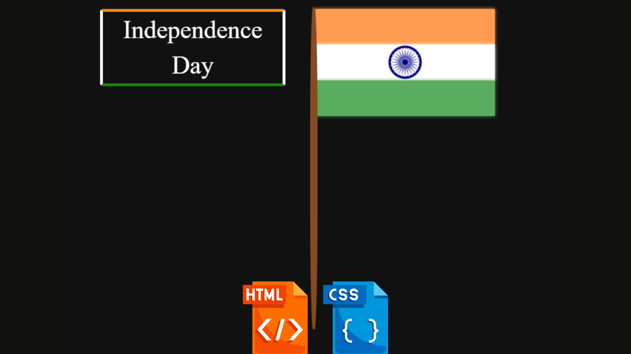
The most proud moment for every Indian is when they see the pride of our country “Our National Flag.” Creating an animated tri-color Indian flag using HTML and CSS is a great way to show our gratitude towards our country. It also shows how skilled we are at our work, and creating this type of project helps increase our frontend skills. In this article, we will learn a step-by-step method for making the Indian flag using only HTML and CSS. For me personally and for our mighty nation of India, this is a highly fascinating subject.
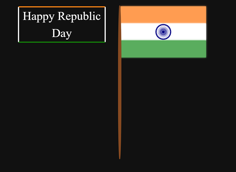
We will design our Indian flag with the basics of HTML and CSS, with swirl animation that looks like our flag is floating in the air. We have used the basics of HTML and CSS concepts. By following along with the article, you guys can easily understand the concept of CSS animation, and then you can also create another type of project of your own.
| Code by | procoding13 |
| Project Download | Link Available Below |
| Language used | HTML and CSS |
| External link / Dependencies | NO |
| Responsive | YES |
Before we dive into the steps of creating an animated Indian flag using HTML and CSS, We must learn about animation and how to create animation with CSS.
What is Animation?
CSS Animation is a micro concept of css that helps in adding the real movement to the elements of our project.We use the keyframes inside our css to add the animation and movement to the elements of the website.
100+ JavaScript Projects With Source Code ( Beginners to Advanced)
So let’s start writing Html code with proud💪🇮🇳 .
Html Code For Indian Flag
<!DOCTYPE html>
<html lang="en">

<head>
  <meta charset="UTF-8">
  <meta http-equiv="X-UA-Compatible" content="IE=edge">
  <meta name="viewport" content="width=device-width, initial-scale=1.0">
  <title>Independence Day</title>
  <link rel="stylesheet" href="style.css">
</head>

<body>

  <body>
    <div id="top"></div>
    <div id="middle">
      <img src="http://upload.wikimedia.org/wikipedia/commons/thumb/1/17/Ashoka_Chakra.svg/50px-Ashoka_Chakra.svg.png">
    </div>
    <div id="bottom"></div>
    <div id="rod"></div>
    <div id="text">Independence Day</div>
  </body>

</html>
Flag Structure:
Inside our HTML file, we have first added some important links for our project. We will be using an external CSS file for styling our Indian flag. Using the <link> tag, we will add the link to the external CSS file.
Then, inside the body tag, using the block level element, we will create three different block level containers for all three parts of our Indian flag🇮🇳. Using the block level element, we will create three sections inside our flag, and using the img tag, we will add “Ashoka Chakkar” inside our middle section of the flag to give a complete look to our Indian flag🇮🇳.
So this is all html code for our Indian flag code. We use only html code, and as you can see in our code, we link CSS files as well, so when we write CSS code, it’s easy to see a preview.
For creating html structure we use a simple html div tag and an image tag in the image we have our ashoka chakra🇮🇳 . And after the image tag, we have text independence day you can change text like any motivation line our proud line of india🇮🇳.
Portfolio Website Using HTML CSS And JAVASCRIPT ( Source Code)
Indian Flag html output
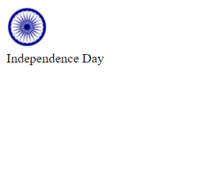
So let’s write css code and style our flag 🇮🇳.
Css Code For Indian Flag
ADVERTISEMENT
body {
    background: #111;
    position: relative;
    left: 45%;
    top: 15px;
        overflow: hidden;
}
#top {
    height: 50px;
    background: #ff9c51;
    box-shadow: 0 0 5px #ff9c51;
    -webkit-animation: top_anim 4.5s infinite;
    animation: top_anim 4.5s infinite;
}
@-webkit-keyframes top_anim
{
    0% {width: 0px;}
    30%{width: 250px;}
    70%{width: 250px;}
    100%{width: 0px;}
}
@keyframes top_anim
{
    0% {width: 0px;}
    30%{width: 250px;}
    70%{width: 250px;}
    100%{width: 0px;}
}
#middle {
    height: 50px;
    background: white;
    box-shadow: 0 0 5px white;
    -webkit-animation: middle_anim 4.5s infinite;
    animation: middle_anim 4.5s infinite;
    -webkit-animation-delay: .2s;
    animation-delay: .2s;
}
@-webkit-keyframes middle_anim
{
    0% {width: 0px;}
    30%{width: 250px;}
    70%{width: 250px;}
    100%{width: 0px;}
}
@keyframes middle_anim
{
    0% {width: 0px;}
    30%{width: 250px;}
    70%{width: 250px;}
    100%{width: 0px;}
}
#middle img {
    display: block;
    width: 50px;
    height: 50px;
    margin: auto;
    -webkit-animation: img_anim 4.5s infinite linear;
    -webkit-animation-delay: .2s;
    animation: img_anim 4.5s infinite;
    animation-delay: .2s;
}
@-webkit-keyframes img_anim
{
    0% {opacity: 0;}
    30% {opacity: 0;-webkit-transform:rotate(0deg);transform:rotate(0deg);-ms-transform:rotate(0deg);}
    38% {opacity: 1;}
    62% {opacity: 1;}
    70% {opacity: 0;-webkit-transform:rotate(360deg);transform:rotate(360deg);-ms-transform:rotate(360deg);}
    100% {opacity: 0;}
}
@keyframes img_anim
{
    0% {opacity: 0;}
    30% {opacity: 0;-webkit-transform:rotate(0deg);transform:rotate(0deg);-ms-transform:rotate(0deg);}
    38% {opacity: 1;}
    62% {opacity: 1;}
    70% {opacity: 0;-webkit-transform:rotate(360deg);transform:rotate(360deg);-ms-transform:rotate(360deg);}
    100% {opacity: 0;}
}
#bottom {
    height: 50px;
    background: #5aad5e;
    box-shadow: 0 0 5px #5aad5e;
    -webkit-animation: bottom_anim 4.5s infinite;
    animation: bottom_anim 4.5s infinite;
    -webkit-animation-delay: .4s;
    animation-delay: .4s;
}
@-webkit-keyframes bottom_anim
{
    0% {width: 0px;}
    30%{width: 250px;}
    70%{width: 250px;}
    100%{width: 0px;}
}
@keyframes bottom_anim
{
    0% {width: 0px;}
    30%{width: 250px;}
    70%{width: 250px;}
    100%{width: 0px;}
}
#rod {
    width: 10px;
    height: 450px;
    background: #874a21;
    position: relative;
    top: -152px;
    left: -7px;
  border-radius: 40%;
}
#text {
  font-size: 35px;
  color: white;
  line-height: 50px;
  text-align: center;
  border-top: 4px solid #FF8915;
  border-left: 4px solid white;
  border-right: 4px solid white;
  border-bottom: 4px solid #148809;
  border-radius: 4px;
  display: block;
  width: 250px;
  height: 100px;
  position: relative;
  left: -300px;
  top: -600px;
  -webkit-animation: text_anim 4.5s infinite;
  animation: text_anim 4.5s infinite;
}
@-webkit-keyframes text_anim {
  0% {text-shadow: 0 0 20px #6da2ff;}
  50% {text-shadow: none;}
  100% {text-shadow: 0 0 20px #6da2ff;}
}
@keyframes text_anim {
  0% {text-shadow: 0 0 20px #6da2ff;}
  50% {text-shadow: none;}
  100% {text-shadow: 0 0 20px #6da2ff;}
}
ADVERTISEMENT
Step1:We’ll first add some fundamental styling to our page’s body using the body tag selector. In order to hide the overflow content, we will use the overflow property to set the overflow as “hidden” and the background attribute to set the background as “black,” relative to the position.
ADVERTISEMENT
body {
    background: #111;
    position: relative;
    left: 45%;
    top: 15px;
    overflow: hidden;
}
Step2: Now using the id selector (#top) we will add a height of 50px to the top section of our flag. Then using the background property we will set the bakcground as “Orange” and using the animation property we will add an animation of increase width with the help of keyframes.
ADVERTISEMENT
How To Create Movie App Using HTML & CSS
ADVERTISEMENT
#top {
    height: 50px;
    background: #ff9c51;
    box-shadow: 0 0 5px #ff9c51;
    -webkit-animation: top_anim 4.5s infinite;
    animation: top_anim 4.5s infinite;
}

@-webkit-keyframes top_anim {
    0% {
        width: 0px;
    }
    30% {
        width: 250px;
    }
    70% {
        width: 250px;
    }
    100% {
        width: 0px;
    }
}

@keyframes top_anim {
    0% {
        width: 0px;
    }
    30% {
        width: 250px;
    }
    70% {
        width: 250px;
    }
    100% {
        width: 0px;
    }
}
Step3: Now using the id selector (#middle) we will add styling to the middle section of our flag.we will add a height of 50px to the middle section of our flag. Then using the background property we will set the bakcground as “white” and using the animation property we will add an animation of increase width with the help of keyframes.
Memory Game Using HTML, CSS, & JavaScript (Source Code)
#middle {
    height: 50px;
    background: white;
    box-shadow: 0 0 5px white;
    -webkit-animation: middle_anim 4.5s infinite;
    animation: middle_anim 4.5s infinite;
    -webkit-animation-delay: .2s;
    animation-delay: .2s;
}

@-webkit-keyframes middle_anim {
    0% {
        width: 0px;
    }
    30% {
        width: 250px;
    }
    70% {
        width: 250px;
    }
    100% {
        width: 0px;
    }
}

@keyframes middle_anim {
    0% {
        width: 0px;
    }
    30% {
        width: 250px;
    }
    70% {
        width: 250px;
    }
    100% {
        width: 0px;
    }
}

#middle img {
    display: block;
    width: 50px;
    height: 50px;
    margin: auto;
    -webkit-animation: img_anim 4.5s infinite linear;
    -webkit-animation-delay: .2s;
    animation: img_anim 4.5s infinite;
    animation-delay: .2s;
}

@-webkit-keyframes img_anim {
    0% {
        opacity: 0;
    }
    30% {
        opacity: 0;
        -webkit-transform: rotate(0deg);
        transform: rotate(0deg);
        -ms-transform: rotate(0deg);
    }
    38% {
        opacity: 1;
    }
    62% {
        opacity: 1;
    }
    70% {
        opacity: 0;
        -webkit-transform: rotate(360deg);
        transform: rotate(360deg);
        -ms-transform: rotate(360deg);
    }
    100% {
        opacity: 0;
    }
}

@keyframes img_anim {
    0% {
        opacity: 0;
    }
    30% {
        opacity: 0;
        -webkit-transform: rotate(0deg);
        transform: rotate(0deg);
        -ms-transform: rotate(0deg);
    }
    38% {
        opacity: 1;
    }
    62% {
        opacity: 1;
    }
    70% {
        opacity: 0;
        -webkit-transform: rotate(360deg);
        transform: rotate(360deg);
        -ms-transform: rotate(360deg);
    }
    100% {
        opacity: 0;
    }
}
Step4: Now we will add styling to the third section of our flag. Using the bottom id selector we will set the height as “50px” and using the background property we will set the background as “green”and using the animation property we will add animation to the bottom of the flag.
I Love You Using HTML and CSS Code
#bottom {
    height: 50px;
    background: #5aad5e;
    box-shadow: 0 0 5px #5aad5e;
    -webkit-animation: bottom_anim 4.5s infinite;
    animation: bottom_anim 4.5s infinite;
    -webkit-animation-delay: .4s;
    animation-delay: .4s;
}

@-webkit-keyframes bottom_anim {
    0% {
        width: 0px;
    }
    30% {
        width: 250px;
    }
    70% {
        width: 250px;
    }
    100% {
        width: 0px;
    }
}

@keyframes bottom_anim {
    0% {
        width: 0px;
    }
    30% {
        width: 250px;
    }
    70% {
        width: 250px;
    }
    100% {
        width: 0px;
    }
}

#rod {
    width: 10px;
    height: 450px;
    background: #874a21;
    position: relative;
    top: -152px;
    left: -7px;
    border-radius: 40%;
}

#text {
    font-size: 35px;
    color: white;
    line-height: 50px;
    text-align: center;
    border-top: 4px solid #FF8915;
    border-left: 4px solid white;
    border-right: 4px solid white;
    border-bottom: 4px solid #148809;
    border-radius: 4px;
    display: block;
    width: 250px;
    height: 100px;
    position: relative;
    left: -300px;
    top: -600px;
    -webkit-animation: text_anim 4.5s infinite;
    animation: text_anim 4.5s infinite;
}

@-webkit-keyframes text_anim {
    0% {
        text-shadow: 0 0 20px #6da2ff;
    }
    50% {
        text-shadow: none;
    }
    100% {
        text-shadow: 0 0 20px #6da2ff;
    }
}

@keyframes text_anim {
    0% {
        text-shadow: 0 0 20px #6da2ff;
    }
    50% {
        text-shadow: none;
    }
    100% {
        text-shadow: 0 0 20px #6da2ff;
    }
}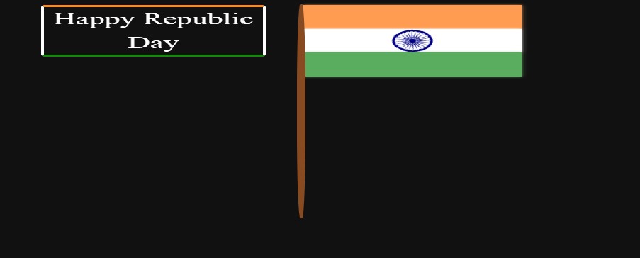
Yes, this is a 100+ line code of css for our Indian flag 🇮🇳 code.
50+ HTML, CSS & JavaScript Projects With Source Code
We complete our code. You can see the output screenshot and video preview of how awesome our Indian🇮🇳 flag is.
Final Output Of our Indian Html And CSS Code
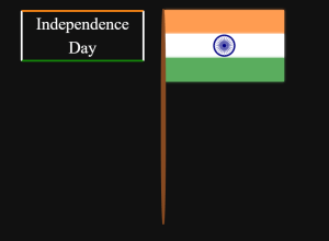
You can see in the video, that the Indian flag with animation is made by pure Html css. In flag, Ashoka chakra rotates animation and text coming animation also.
In css, we use a simple css selector to target our Html elements. We use Keyframe for animation, so our Ashoka chakra🇮🇳 rotates by animation. Then we simply styled our text and give an animation so it’s run every second.
Ecommerce Website Using Html Css And Javascript Source Code
That’s it for this project, hope you like our blog and give it a try and try creating the Indian flag using Html css.
If you need any more project-related frontend. Visit our homepage and you get 100+ projects💝.
if you have any confusion Comment below or you can contact us by filling out our contact us form from the home section. 🤞🎉
Code By – procoding13
written by – Codewithrandom
Which code editor do you use for this Indian Flag coding?
I personally recommend using VS Code Studio, it’s straightforward and easy to use.
What is Animation
CSS animation is the process of making elements change their state from one state to another smoothly over time using Cascading Style Sheets (CSS). We use keyframes inside CSS to add the animation in different frames that are continuous, which provides a smooth transition.
When do we celebrate Independence Day, and what is its importance?
Every year, we celebrate Independence Day on August 15. Independence Day holds a significant position in the hearts of every Indian. Independence Day describes how our great freedom fighters fought against the British to make our country a democratic country.
