Happy Birthday Wishes Using HTML and CSS
Hello coders, Welcome back to our blog , In this blog we are talking about Birthday Wishes using HTML & CSS
So, if you’re thinking about wishing your loved ones through a project and make their day more special, you have come to the right blog,
So let’s start happy birthday animation HTML code blog with free source code
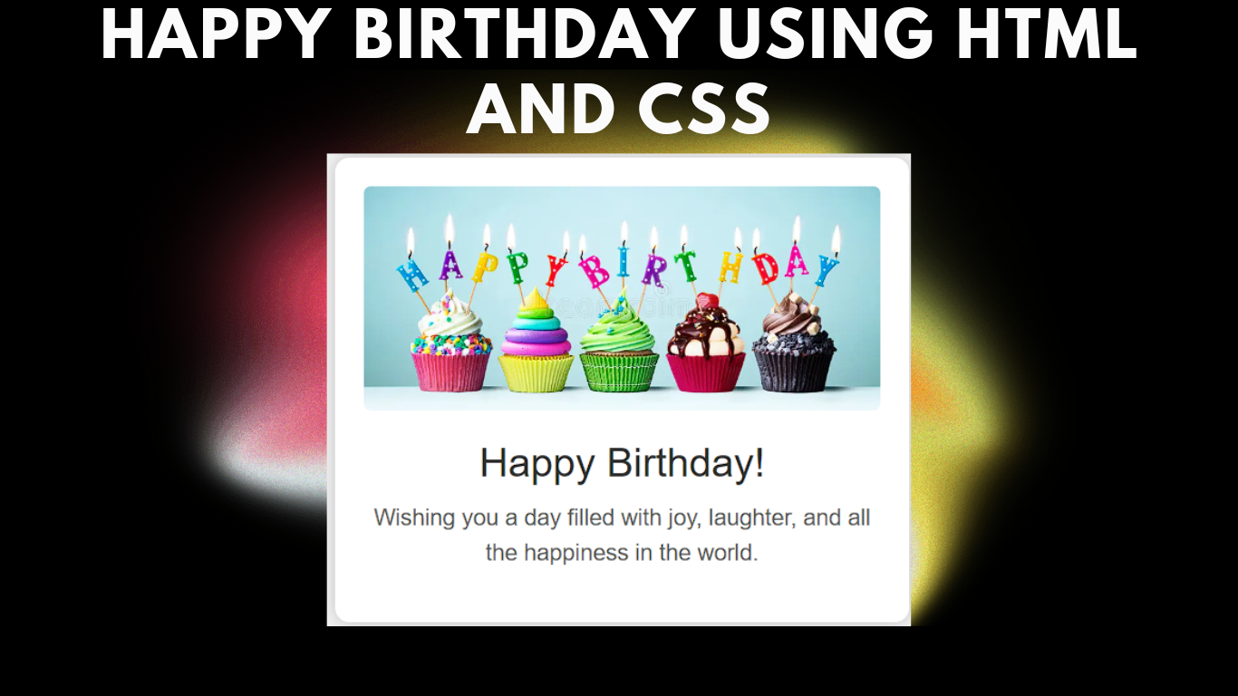
You can customize the message and add even more special touches to the recipient’s day by using HTML and CSS to create a unique card. In this article, we will guide you step-by-step on how we can create customized birthday wishes for your loved ones using HTML and CSS.
100 Day , 100 HTML CSS JavaScript Projects
HTML Structure:
Let’s start with creating a basic structure of HTML for a birthday wish card. We will create a main container that will contain the card content. The container includes the message along with an image, which we will be styling using CSS.
<!DOCTYPE html>
<html lang="en">
<head>
    <meta charset="UTF-8">
    <meta name="viewport" content="width=device-width, initial-scale=1.0">
    <link rel="stylesheet" type="text/css" href="styles.css">
    <title>Birthday Wishes Card</title>
</head>
<body>
    <div class="birthday-card">
        <img src="https://thumbs.dreamstime.com/b/colorful-happy-birthday-cupcakes-candles-spelling-148323072.jpg" alt="Birthday Balloons" class="animate">
        <h1 class="animate">Happy Birthday!</h1>
        <p class="animate">Wishing you a day filled with joy, laughter, and all the happiness in the world.</p>
    </div>
</body>
</html>
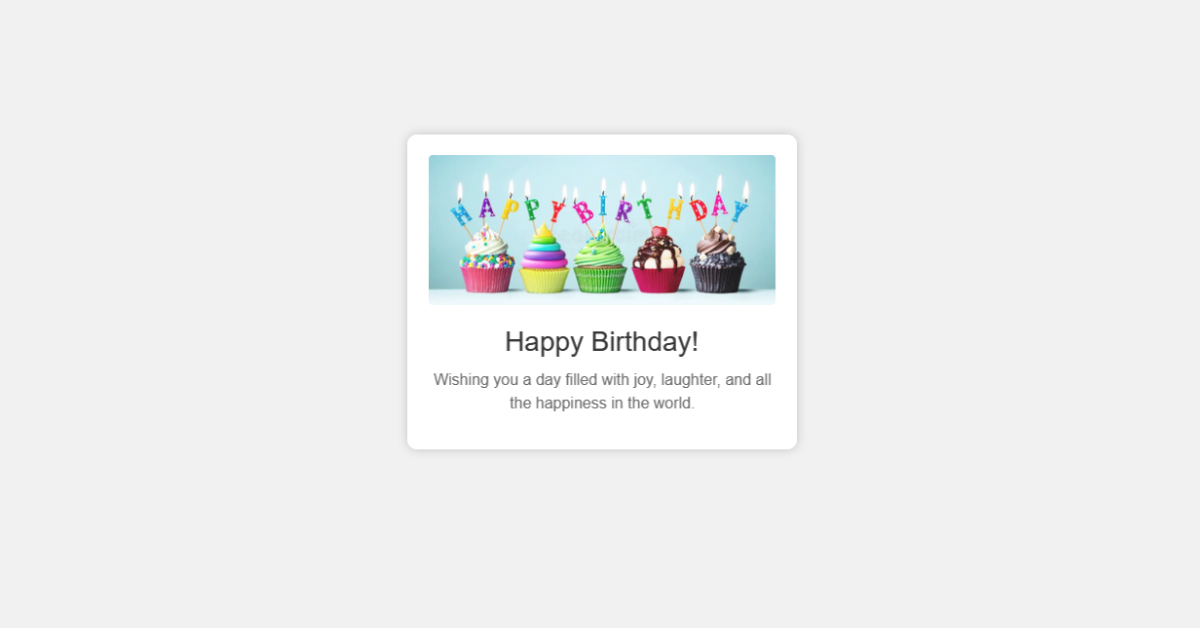
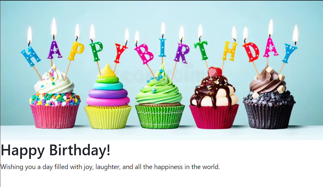
We will first add a title to our webpage using the title tag inside the head tag of HTML, and we will also add the link to the external CSS files that will be used for adding the styling of our birthday wishes card. Now inside the body tag, using the block level tag <div> with class “birthday-card,” we will use this as the main container for our birthday wishes. Now inside our main container, using the <img> tag, we will add an image inside our birthday wish card, and then using the <h1> tag with class animate, we will add animation to the main birthday heading of the card, and then using the <p> tag, we will add some wishes under the card.
HTML Output:
Styling and Animation (CSS)
Now, let’s add some CSS to style our birthday wishes card. You can either place the CSS code within a <style> tag in the HTML document or in a separate external CSS file. Here, we’ll use an external CSS file named styles.css
/* /* styles.css */

body {
    margin: 0;
    padding: 0;
    font-family: Arial, sans-serif;
    background-color: #f1f1f1;
}

.birthday-card {
    text-align: center;
    max-width: 400px;
    margin: 50px auto;
    padding: 20px;
    background-color: #ffffff;
    border-radius: 10px;
    box-shadow: 0 0 10px rgba(0, 0, 0, 0.2);
}

img {
    width: 100%;
    max-height: 200px;
    object-fit: cover;
    border-radius: 5px;
    animation: fadeIn 2s ease infinite;
}

h1 {
    font-size: 28px;
    color: #333;
    margin-top: 20px;
    animation: slideInLeft 1.5s ease infinite;
}

p {
    font-size: 16px;
    color: #666;
    margin-top: 10px;
    animation: slideInRight 1.5s ease infinite;
}

@keyframes fadeIn {
    0% { opacity: 0; transform: scale(0.9); }
    100% { opacity: 1; transform: scale(1); }
}

@keyframes slideInLeft {
    0% { opacity: 0; transform: translateX(-20px); }
    100% { opacity: 1; transform: translateX(0); }
}

@keyframes slideInRight {
    0% { opacity: 0; transform: translateX(20px); }
    100% { opacity: 1; transform: translateX(0); }
}
 */
Styling body and Container:
Using the body tag, we will set the padding and margin to zero from the browser’s default padding and margin, and using the font-family property, we will set the font-family to Arial, and using the background color property, we will set the background of the body to “off white.” .
Create Portfolio Website Using HTML and CSS (Source Code)
Then, using the class selector (.birthday-card), we will use the text align property to align the text to the center of the webpage. Using the max-width property, we will set the maximum width to 400px, and using the margin property, we will add a margin of 50px from top to bottom.
/* /* styles.css */

body {
    margin: 0;
    padding: 0;
    font-family: Arial, sans-serif;
    background-color: #f1f1f1;
}

.birthday-card {
    text-align: center;
    max-width: 400px;
    margin: 50px auto;
    padding: 20px;
    background-color: #ffffff;
    border-radius: 10px;
    box-shadow: 0 0 10px rgba(0, 0, 0, 0.2);
}
Styling Image & Message:
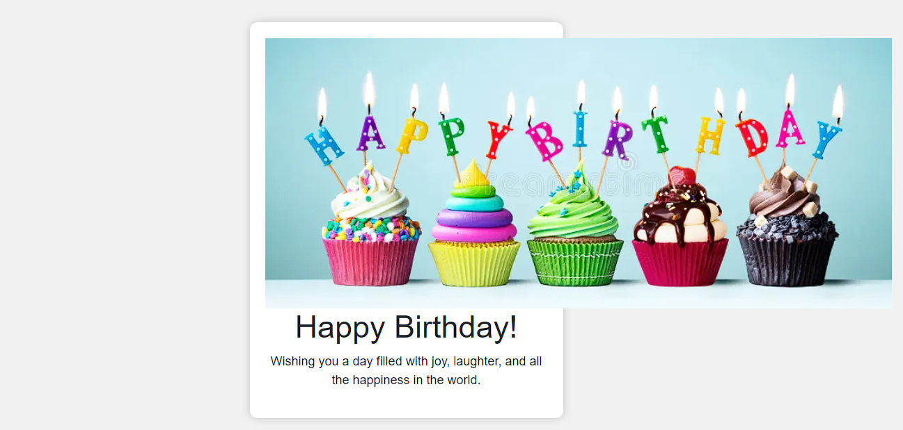
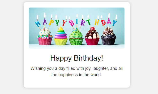
Using the img tag selector, we will set the width to 100%, and using the max-height property, we will set the maximum height to 200px. Using the object-fit property, we will change the size to fit the main container, and using the border radius property, we will add a border radius to give a soft look to the corners of the images. Also, using the animation property, we will add a fade-in animation with a delay of 2 seconds.
Now using the h1 tag and p tag, we will add styling to the birthday wishes in the birthday car. Using the <h1> tag selector, we will set the font size to 28px, and using the color property, we will add white color to our birthday card. We will also add some animation to our text. We will also add an animation in which the text will slide into the card from the left.
img {
    width: 100%;
    max-height: 200px;
    object-fit: cover;
    border-radius: 5px;
    animation: fadeIn 2s ease infinite;
}

h1 {
    font-size: 28px;
    color: #333;
    margin-top: 20px;
    animation: slideInLeft 1.5s ease infinite;
}

p {
    font-size: 16px;
    color: #666;
    margin-top: 10px;
    animation: slideInRight 1.5s ease infinite;
}
Adding Animation:
@keyframes fadeIn {
    0% { opacity: 0; transform: scale(0.9); }
    100% { opacity: 1; transform: scale(1); }
}

@keyframes slideInLeft {
    0% { opacity: 0; transform: translateX(-20px); }
    100% { opacity: 1; transform: translateX(0); }
}

@keyframes slideInRight {
    0% { opacity: 0; transform: translateX(20px); }
    100% { opacity: 1; transform: translateX(0); }
}
 */
We will add animation to our birthday wish card using the keyframes. We will add two frames for our animation, with frames at 0% and 100%.
fadeIn: This animation increases the element up from 90% of its original size to 100% while progressively increasing its opacity. It makes the image appear to be fading in.
slideInLeft: In this animation, the element is initially transparent and moved 20 pixels to the left. It then gradually increases opacity and returns to its starting position. It allows the words “Happy Birthday!” to slide in from the left.
slideInRight: Like slideInLeft, this animation uses a transparent element that is moved 20 pixels to the right before gradually increasing its opacity and returning it to its starting position. It causes the birthday message text to slide in from the right.
These keyframes are responsible for adding animations to our birthday card, making it visually appealing and providing great user experience.
final Output:
Conclusion:
Creating animated wishing cards for birthday wishes is a unique way to wish your loved ones. This not only shows your love and care for them but also how much you love them. In this project, you can do infinite customization; you can add animation, photos, videos, and slideshows using only HTML and CSS only.Most important, happy birthday to your loved ones, and happy coding!
Codepen Preview:
ADVERTISEMENT
FAQ Section:
Q1. Do I need to be an Expert for Creating this birthday Card?
Ans: No, you do not need to be an expert to create such a simple birthday wishing card. You just need to be aware of basic HTML and CSS properties and styling for creating this type of project.
ADVERTISEMENT
Q2. How do I send this wish Card to someone?
Ans: You can send the card via email by copying the HTML and CSS code into an email and sending it as an HTML email. Alternatively, you can host the card on a personal website and share the URL with the recipient. Converting the card to a PDF and sending it as an attachment is also an option.
ADVERTISEMENT
Follow: Codewithrandom
ADVERTISEMENT
Author: Arun
ADVERTISEMENT
Stay With Us :- Codewithrandom.com
