Create Rain Animation Using HTML and CSS
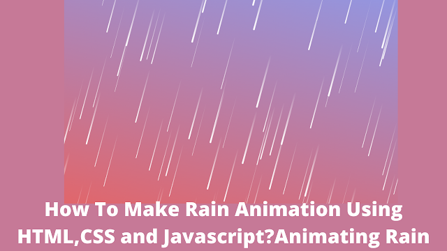
Hello Coder! Welcome to today’s lesson. We’ll make a Rain Animation Effect Using HTML and CSS. The website has been enhanced with a number of effects, including this Rain Animation, to make it look more user-friendly and attractive.
.png)
| Code by | N/A |
| Project Download | Link Available Below |
| Language used | HTML,CSS, and JavaScript |
| External link / Dependencies | No |
| Responsive | Yes |
You need basic ES6 knowledge for this javascript project. This tutorial is well suited for javascript intermediates. Let us get started with the project
50+ HTML, CSS & JavaScript Projects With Source Code
Live Preview Of Rain Animation Using CSS:-
Before moving forward to the code first of all we will see the live preview of the code so you can see how it is working on clicking the button.
Portfolio Website using HTML and CSS (Source Code)
Html Rain Effect Code:-
We start with the HTML section. First, copy the code provided below into your HTML File.
<!DOCTYPE html>
<html lang="en">
    <head>
        <meta charset="UTF-8" />
        <meta http-equiv="X-UA-Compatible" content="IE=edge" />
        <meta name="viewport" content="width=device-width, initial-scale=1.0" />
        <title>Document</title>
    </head>
    <body></body>
</html>
We don’t need any particular components to add structure to our HTML, but the body tag is necessary to style our website. We’ll include two links in our HTML file: one for the javascript file link and the other for the CSS file link.
<!-----CSS File------>
<link rel="stylesheet" href="style.css">
<!-----Javascript File---->
<script src="script.js"></script>
Rain Animation Css Code:-
Linear Gradient For Rain Animation – To create a linear gradient you must define at least two color stops. Color stops are the colors you want to render smooth transitions among. You can also set a starting point and a direction (or an angle) along with the gradient effect.
background-image: linear-gradient(direction, color-stop1, color-stop2, …);
@Keyframes (animation):-
- The @keyframes rule specifies the animation code.
- The animation is created by gradually changing from one set of CSS styles to another.
- During the animation, you can change the set of CSS styles many times.
- Specify when the style change will happen in percent, or with the keywords “from” and “to”, which is the same as 0% and 100%. 0% is the beginning of the animation, 100% is when the animation is complete.
- @keyframes animationname {keyframes-selector {css-styles;}}
we have used keyframes for animating the rains and linear gradient to make the background gradient in color.
body {
  margin: 0;
  padding: 0;
  background: linear-gradient(15deg, #e66465, #9198e5);
  transform: rotate(15deg);
  height: 100vh;
  overflow: hidden;
}
i {
  position: absolute;
  height: 160px;
  background: linear-gradient(transparent, #fff);
  border-bottom-left-radius: 5px;
  border-bottom-right-radius: 5px;
  animation: raining 5s linear Infinite;
}
@-moz-keyframes raining {
  0% {
    transform: translateY(-160px);
  }
  100% {
    transform: translateY(calc(100vh + 160px));
  }
}
@-webkit-keyframes raining {
  0% {
    transform: translateY(-160px);
  }
  100% {
    transform: translateY(calc(100vh + 160px));
  }
}
@-o-keyframes raining {
  0% {
    transform: translateY(-160px);
  }
  100% {
    transform: translateY(calc(100vh + 160px));
  }
}
@keyframes raining {
  0% {
    transform: translateY(-160px);
  }
  100% {
    transform: translateY(calc(100vh + 160px));
  }
}
Step1:The padding and margin will be set to “zero” using the body tag selector. The background property will be used to set a linear gradient using the colours “red” and “blue,” and the overflow property will be used to set the overflow to “hidden,” preventing extra data from displaying outside the container.
body {
    margin: 0;
    padding: 0;
    background: linear-gradient(15deg, #e66465, #9198e5);
    transform: rotate(15deg);
    height: 100vh;
    overflow: hidden;
}
Step2: The position will now be set to “absolute” using the tag selector I the height will be set to “160 px” using the height property, the background colour will be set to a linear gradient using transparent and white, and the animation property will be used to add an animation of rain falling after a 5-second delay until it never stops.
Ecommerce Website Using HTML, CSS, & JavaScript (Source Code)
Keyframes will be used to add the motion to our project after which it will be translated to “-160px” in the y-axis using the transform property.
i {
    position: absolute;
    height: 160px;
    background: linear-gradient(transparent, #fff);
    border-bottom-left-radius: 5px;
    border-bottom-right-radius: 5px;
    animation: raining 5s linear Infinite;
}

@-moz-keyframes raining {
    0% {
        transform: translateY(-160px);
    }
    100% {
        transform: translateY(calc(100vh + 160px));
    }
}

@-webkit-keyframes raining {
    0% {
        transform: translateY(-160px);
    }
    100% {
        transform: translateY(calc(100vh + 160px));
    }
}

@-o-keyframes raining {
    0% {
        transform: translateY(-160px);
    }
    100% {
        transform: translateY(calc(100vh + 160px));
    }
}

@keyframes raining {
    0% {
        transform: translateY(-160px);
    }
    100% {
        transform: translateY(calc(100vh + 160px));
    }
}
CSS Output:

JavaScript Code For Smooth Rain Animation Effect:-
The querySelector() method returns the first element that matches a CSS selector.
To add a new element to the HTML DOM, you must create the element (element node) first, and then append it to an existing element. create an element() is used to create an element and an element. append child is used to insert a child.
We have made many children rain droplets and inserted them in the body tag.
10+ Javascript Projects For Beginners With Source Code
We also have given different speeds to the different rain droplets.
animation time and animation delay are also given to the droplets.
we are using a random function of the math library of javascript that will generate a random number between 0 to 1.
function meteor() {
let amount = 150;
let body = document.querySelector("body");
let count = 0;
while (count < amount) {
let drop = document.createElement("i");
let size = Math.random() * 5;
let posX = Math.floor(Math.random() * window.innerWidth);
let delay = Math.random() * -20;
let duration = Math.random() * 5;
drop.style.width = `${0.1 + size}px`;
drop.style.left = `${posX}px`;
drop.style.animationDelay = `${delay}s`;
drop.style.animationDuration = `${1 + duration}s`;
body.appendChild(drop);
count++;
}
}
meteor();
Final Output Of Rain Effect Animation Using CSS:-
Code Credit:- Evan
I hope hoped loved this blog and learned many things at the place please let us know your review in the comment section if you liked it please comment below as it will give us the motivation to create more blogs.
If you faced any difficulty feel free to comment down your problems and If you really liked it, please show your love in the comment section this really motivates a blogger to provide more such content.
ADVERTISEMENT
Written by @Himanshu Singh.
ADVERTISEMENT
Which Code Editor do you use for this Rain Animation Coding?
I personally recommend using VS Code Studio, It’s straightforward and easy to use.
ADVERTISEMENT
What is Rain Animation Effect?
Keyframes and CSS animation were used to make the animated background known as The Rain Animation Effect. These motion effects are used to make the website look more attractive.
ADVERTISEMENT
What is the use of rain animation effect?
The website’s appearance can be improved and made more attractive by using rain animation or one of many other effects of this kind.
ADVERTISEMENT


