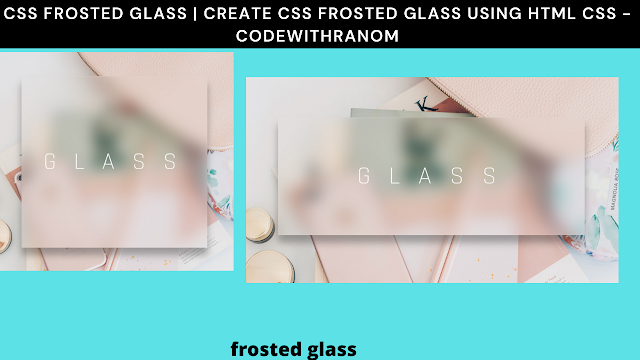
Frosted Glass Effect Using CSS
Welcome to the Codewithrandom blog. In this blog, We learn how to create Frosted Glass Effect. We use HTML and CSS for this Frosted Glass Effect.
I hope you enjoy our blog so let’s start with a basic Html Structure for a Frosted Glass Effect.
HTML Code For Frosted Glass Effect
<div class="drop-shadow">
<div class="glass"></div>
<span>GLASS</span>
</div>
There is all the Html Code for the Frosted Glass Effect. Now, you can see output without CSS, Then we write Css for Frosted Glass Effect.
50+ HTML, CSS & JavaScript Projects With Source Code
Html Code Output
@import url("https://fonts.googleapis.com/css?family=Rajdhani:300&display=swap");
body, html {
  height: 100%;
  margin: 0;
  padding: 0;
}

body {
  display: flex;
  justify-content: center;
  align-items: center;
  background-image: url("https://s3-us-west-2.amazonaws.com/s.cdpn.io/1376484/jess-harding-lqT6NAmTaiY-unsplash.jpg");
  background-size: cover;
  background-position: center;
  font-family: "Rajdhani", sans-serif;
}

*, *:before, *:after {
  box-sizing: border-box;
}

.glass {
  height: 100%;
  width: 100%;
  background-image: url("https://s3-us-west-2.amazonaws.com/s.cdpn.io/1376484/jess-harding-lqT6NAmTaiY-unsplash.jpg");
  background-size: cover;
  background-position: center;
  clip-path: inset(10em);
  filter: blur(20px);
  display: flex;
  justify-content: center;
  align-items: center;
}

.drop-shadow {
  height: 100%;
  width: 100%;
  filter: drop-shadow(0px 20px 10px rgba(0, 0, 0, 0.3));
  display: flex;
  justify-content: center;
  align-items: center;
}
.drop-shadow:before {
  display: block;
  content: "";
  position: absolute;
  top: 10em;
  height: calc(100% - 20em);
  width: calc(100% - 20em);
  border-top: 2px solid rgba(225, 225, 225, 0.2);
  border-left: 1px solid rgba(225, 225, 225, 0.1);
  border-right: 1px solid rgba(225, 225, 225, 0.3);
  z-index: 2;
}
.drop-shadow > span {
  position: absolute;
  z-index: 5;
  color: white;
  font-size: 4em;
  letter-spacing: 0.75em;
  padding-left: 0.375em;
}

@media (max-width: 980px) {
  .glass {
    clip-path: inset(5em);
  }
  .drop-shadow:before {
    top: 5em;
    width: calc(100% - 10em);
  }
  .drop-shadow > span {
    font-size: 4em;
  }
}
@media (max-width: 640px) {
  .drop-shadow > span {
    font-size: 2em;
  }
}
Now we have completed our Frosted Glass Effect Using CSS.
Create A Travel Website Using HTML & CSS
Final Output Of Frosted Glass Effect Using CSS
100+ JavaScript Projects With Source Code ( Beginners to Advanced)
Now we have completed our Frosted Glass Effect. Here is our updated output with Html and Css. Hope you like the Frosted Glass Effect Using CSS. you can see output project screenshots. See our other blogs and gain knowledge in front-end development.
Thank you
In this post, we learn how to create a Frosted Glass Effect Using HTML and CSS. If we made a mistake or any confusion, please drop a comment to reply or help you learn easily.
Written by – Code With Random/Anki
Code by – Kyle Wetton


