Create Multiple Flip Card Responsive Using HTML and CSS
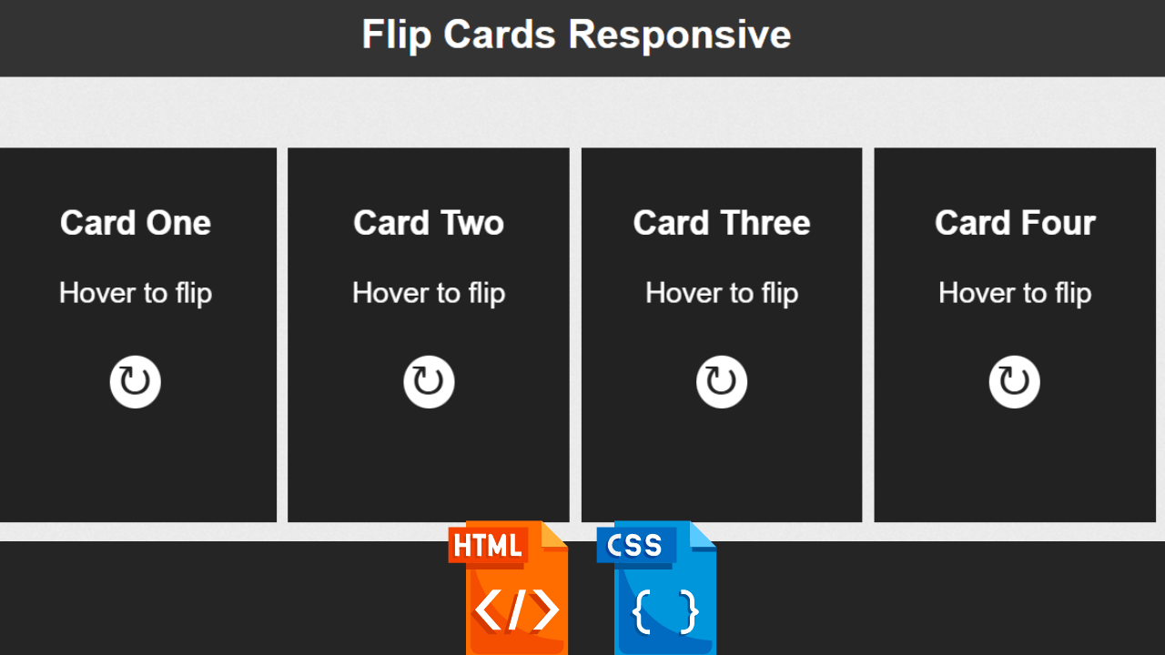
Hello Coder! Welcome to the Codewithrandom blog. In this article, we create a Multiple Flip Card Responsive Using HTML and CSS. When you hover the card turn flip and it’s a completely Responsive 3d Flip Card project.
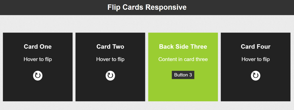
Blocks of content that rotate when touched or held, displaying content on the other side. It’s a nice effect that promotes fun browsing and offers yet another method to display more data without leaving the current page.
100+ HTML,CSS and JavaScript Projects With Source Code ( Beginners to Advanced)
| Code by | Josetxu |
| Project Download | Link Available Below |
| Language used | HTML and CSS |
| External link / Dependencies | No |
| Responsive | Yes |
Live Preview Of Multiple Flip Card Responsive:
So let’s start writing our Html Code for creating Flip Card text and Structure.
Html Code For Flip Card
<!DOCTYPE html>
<html lang="en">
<head>
<meta charset="UTF-8">
<meta http-equiv="X-UA-Compatible" content="IE=edge">
<meta name="viewport" content="width=device-width, initial-scale=1.0">
<title>3d Flip Card Html Css</title>
<link rel="stylesheet" href="style.css">
</head>
<body>
<h1>Flip Cards Responsive</h1>
<div class="boxesContainer">
<div class="cardBox">
<div class="card">
<div class="front">
<h3>Card One</h3>
<p>Hover to flip</p>
<strong>↻</strong>
</div>
<div class="back">
<h3>Back Side One</h3>
<p>Content in card one</p>
<a href="#">Button 1</a>
</div>
</div>
</div>
<div class="cardBox">
<div class="card">
<div class="front">
<h3>Card Two</h3>
<p>Hover to flip</p>
<strong>↻</strong>
</div>
<div class="back">
<h3>Back Side Two</h3>
<p>Content in card two</p>
<a href="#">Button 2</a>
</div>
</div>
</div>
<div class="cardBox">
<div class="card">
<div class="front">
<h3>Card Three</h3>
<p>Hover to flip</p>
<strong>↻</strong>
</div>
<div class="back">
<h3>Back Side Three</h3>
<p>Content in card three</p>
<a href="#">Button 3</a>
</div>
</div>
</div>
<div class="cardBox">
<div class="card">
<div class="front">
<h3>Card Four</h3>
<p>Hover to flip</p>
<strong>↻</strong>
</div>
<div class="back">
<h3>Back Side Four</h3>
<p>Content in card four</p>
<a href="#">Button 4</a>
</div>
</div>
</div>
</div>
<!--.boxesContainer-->
</body>
</html>First, we will add the heading for our flip card animation using the <h1> tag. Next, we will create a container for our card box using the <div> tag with the class “boxesContainer,” add the heading for it using the h3 tag using the div class “card,” and add the content for the paragraph using the <p> tag. We’ll make a receptacle in a similar way for our button 2, button 3, and button 4 flip cards.
This is our card for all four boxes that we use in our Flip Card project. We use 2 div for every box. We create a box and its content in the 2nd div. So create 4 boxes in this same way.
Restaurant Website Using HTML And CSS With Source Code
Here you can see the output with only Html Code👇🥶.
Output:-
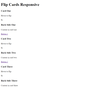
Let’s Write Css Code To Style this 3D Flip Card and Complete Our Project.
10+ Javascript Projects For Beginners With Source Code
CSS Code For Flip Card:-
body {
  color: #333;
  font-family: Arial, Helvetica, serif;
  font-weight: normal;
  margin: 0;
  padding: 0;
  background: url(https://josetxu.com/img/fondo_blanco.png) repeat 0 0 #fff;
}

h1 {
  background: #333;
  color: #fff;
  text-align: center;
  margin: 0 0 5% 0;
  padding: 0.5em;
  margin: 0 0 5% 0;
}

.cardBox {
  float: left;
  font-size: 1.2em;
  margin: 1% 0 0 1%;
  perspective: 800px;
  transition: all 0.3s ease 0s;
  width: 23.7%;
}

.cardBox:hover .card {
  transform: rotateY(180deg);
}

.card {
  background: #222;
  cursor: default;
  height: 300px;
  transform-style: preserve-3d;
  transition: transform 0.4s ease 0s;
  width: 100%;
  -webkit-animation: giro 1s 1;
  animation: giro 1s 1;
}

.card p {
  margin-bottom: 1.8em;
}

.card .front,
.card .back {
  backface-visibility: hidden;
  box-sizing: border-box;
  color: white;
  display: block;
  font-size: 1.2em;
  height: 100%;
  padding: 0.8em;
  position: absolute;
  text-align: center;
  width: 100%;
}

.card .front strong {
  background: #fff;
  border-radius: 100%;
  color: #222;
  font-size: 1.5em;
  line-height: 30px;
  padding: 0 7px 4px 6px;
}

.card .back {
  transform: rotateY(180deg);
}

.card .back a {
  padding: 0.3em 0.5em;
  background: #333;
  color: #fff;
  text-decoration: none;
  border-radius: 1px;
  font-size: 0.9em;
  transition: all 0.2s ease 0s;
}

.card .back a:hover {
  background: #fff;
  color: #333;
  text-shadow: 0 0 1px #333;
}

.cardBox:nth-child(1) .card .back {
  background: cornflowerblue;
}

.cardBox:nth-child(2) .card .back {
  background: orange;
}

.cardBox:nth-child(3) .card .back {
  background: yellowgreen;
}

.cardBox:nth-child(4) .card .back {
  background: tomato;
}

.cardBox:nth-child(2) .card {
  -webkit-animation: giro 1.5s 1;
  animation: giro 1.5s 1;
}

.cardBox:nth-child(3) .card {
  -webkit-animation: giro 2s 1;
  animation: giro 2s 1;
}

.cardBox:nth-child(4) .card {
  -webkit-animation: giro 2.5s 1;
  animation: giro 2.5s 1;
}

@-webkit-keyframes giro {
  from {
    transform: rotateY(180deg);
  }
  to {
    transform: rotateY(0deg);
  }
}

@keyframes giro {
  from {
    transform: rotateY(180deg);
  }
  to {
    transform: rotateY(0deg);
  }
}

@media screen and (max-width: 767px) {
  .cardBox {
    margin-left: 2.8%;
    margin-top: 3%;
    width: 46%;
  }
  .card {
    height: 285px;
  }
  .cardBox:last-child {
    margin-bottom: 3%;
  }
}

@media screen and (max-width: 480px) {
  .cardBox {
    width: 94.5%;
  }
  .card {
    height: 260px;
  }
}
We use a simple css selector to create our flip card project. We style our cards from front and back step by step. That’s why we create multiple div in our html section. Then style the card using child selector elements.
Create Resume/CV Website Using HTML and CSS (Source Code)
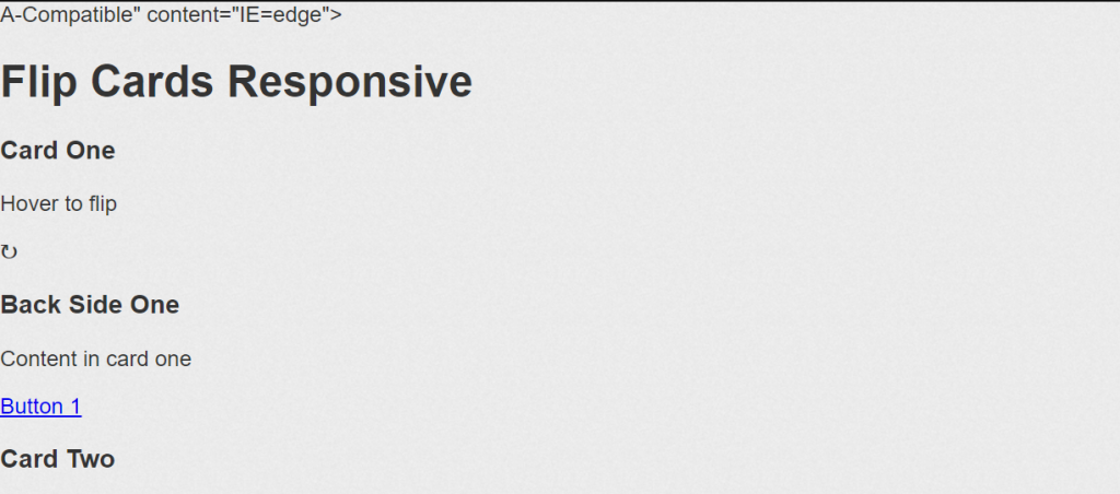
Step1:To begin with, we will style the body of our website using the body tag selector. The typeface family will be “Arial,” the font color will be “white,” and the background property will be used to add an image to the flip card’s background. All of these settings will be made using the properties of the flip card’s properties.
ADVERTISEMENT
body {
  color: #333;
  font-family: Arial, Helvetica, serif;
  font-weight: normal;
  margin: 0;
  padding: 0;
  background: url(https://josetxu.com/img/fondo_blanco.png) repeat 0 0 #fff;
}
ADVERTISEMENT
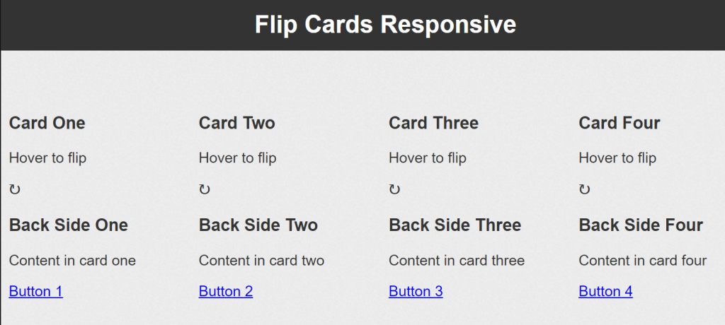
Step2:Our flip card’s backdrop color will now be set to “black” using the h1> tag selector, and its font color will be set to “white” using the color property. We will align the text to the middle using the text-align property.
ADVERTISEMENT
The font-size property will be used to set the font size to 1.2 rem, the margin property to set the border to 1% from the top and left, and the float property to float it to the left when adding styling to the flip card container.
ADVERTISEMENT
h1 {
  background: #333;
  color: #fff;
  text-align: center;
  margin: 0 0 5% 0;
  padding: 0.5em;
  margin: 0 0 5% 0;
}

.cardBox {
  float: left;
  font-size: 1.2em;
  margin: 1% 0 0 1%;
  perspective: 800px;
  transition: all 0.3s ease 0s;
  width: 23.7%;
}

.cardBox:hover .card {
  transform: rotateY(180deg);
}
ADVERTISEMENT
After this, we create an animation so that when we hover over the card it helps and shows back content to us. And for creating responsive css flip cards and it’s really like 3d design 🤯.
100+ JavaScript Projects With Source Code ( Beginners to Advanced)
You can see a final preview here, you can see when we hover on our card it’s turned back in animation, and if we remove the cursor from the card it returns and show front card content. That’s it for this project, and it’s a completely responsive project you can taste it.
Final Output Multiple Flip Card Responsive Using CSS:-
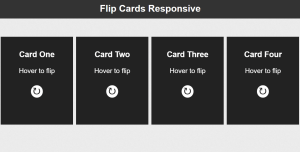
Hope you like this Responsive 3D Flip Card Using HTML and CSS. You Can create your own and use this project in any project as a part project like the reviews section, and a contact form. If you need any more project-related frontend. Visit our homepage and you get 100+ projects💝.
if you have any confusion Comment below or you can contact us by filling out our contact us form from the home section. 🤞🎉
Code By – Josetxu
written by – Codewithrandom
Which code editor do you use for Responsive 3D Flip Card coding?
I personally recommend using VS Code Studio, it’s straightforward and easy to use.
What is the use of flip card?
Flip cards are strong cards that communicate printed information in an easy-to-understand style. They are typically produced in sets. Flip card sets can include a small number of cards or a large number of cards, and they are most frequently used for reference or instructional reasons.
How do you flip a card in HTML and CSS?
The key is to revolve the element by 180 degrees using CSS’s transform property, which is done by typing transform: rotateY.(180deg).
